Be a Design A11y: An Introduction to Accessibility
This is an introductory overview of Accessibility and how it relates to designing and building digital products and experiences. The goal of this post is to provide a general reference for high-level accessibility topics that anyone can use. It is assumed that readers have basic computer literacy and an understanding of how digital products are built.
What Is Accessibility?
Mozilla’s page on What is Accessibility puts it best:
Accessibility is the practice of making your websites usable by as many people as possible. We traditionally think of this as being about people with disabilities, but the practice of making sites accessible also benefits other groups such as those using mobile devices, or those with slow network connections.
In short, caring about accessibility and creating accessible digital products means you’re putting in the effort to ensure that anyone who wants to experience your product can.
What about A11y?
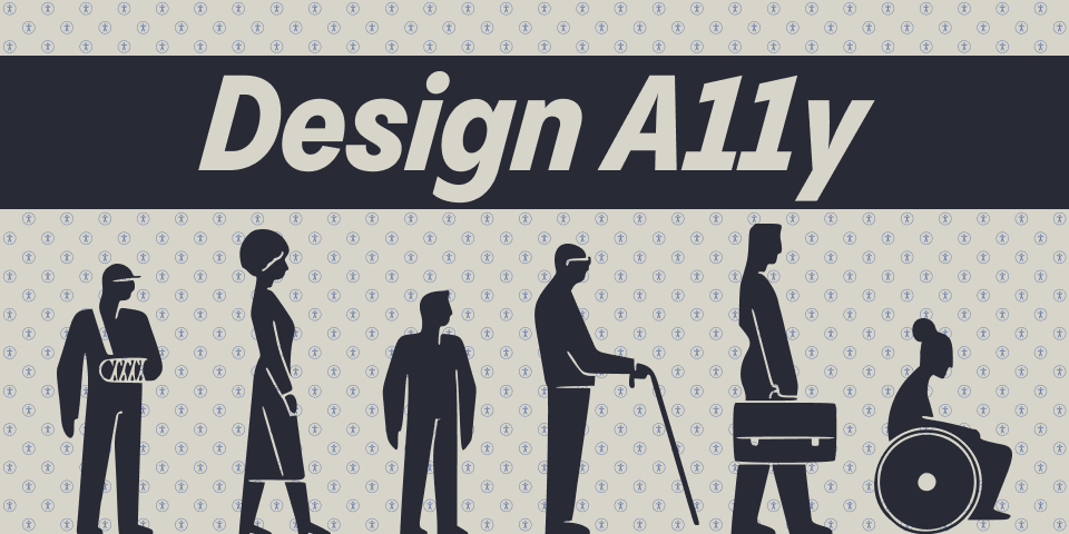
You may often see the term A11y when reading about or looking up accessibility. A11y is a numeronym or number-based word for Accessibility. Similar common numeronyms in the tech space would be L10n and I18N for Localization and Internationalization respectively.
The 11 in A11y stands for the 11 letters between the A and Y in the word accessibility. Due to the fact that the term A11y looks like the word Ally the community often uses the shorter numeronym because we enjoy and encourage the thought that working in accessibility means you’re being an ally to people who need accessibility features and support.
Why should I care about Accessibility?
As a creator of digital products accessibility should always be a consideration at any stage of the product development cycle. According to the CDC, 1 in 4 adults in the US live with some type of disability. On top of this, many accessibility features are not just for disabled individuals, building products with a consideration for accessibility often means that the overall experience will be better for everyone.
As part of their Inclusive Design work, Microsoft has outlined and documented the realities of disability in the modern age. According to the World Health Organization, “Disability is not just a health problem. It is a complex phenomenon, reflecting the interaction between features of a person’s body and features of the society in which he or she lives.” Microsoft has represented this in their guidelines with different modalities of disability they call the Persona Spectrum. For example, a person with 1 arm, a person with an arm injury, and a new parent holding a child all fall into the same modality of “has one arm to interact with the product.”
Additionally depending on the market your product serves there are now many laws in different parts of the world that require digital experiences to be accessible. In recent years that has been an increasing trend of digital product and experiences facing litigation for failing to provide accessible experiences, you can find more details in the 2022 recap report from Level Access.
Understanding Accessibility Principles
So now that we know what accessibility is, how do we actually go about crafting accessible products and experiences?
A good place to start is with the 4 principles of accessibility: perceivable, operable, understandable, and robust, often referred to by the acronym POUR. At it’s most basic these are the 4 pillars on which all other guidelines sit.
Perceivable
Information and user interface components must be presentable to users in ways they can perceive. This means that users must be able to experience the information being presented; it can’t be invisible to any of their senses.
The idea behind the principle of perceivable is that no matter how a user is accessing your product they can experience the content. For a sighted user this is as simple as displaying an image or text on the screen. For a non-sighted or low vision user this would mean adding meaningful alt text to non-text content and ensuring that the text is properly read by a screen-reading tool.
Operable
User interface components and navigation must be operable. This means that users must be able to use the interface and it cannot require interaction that a user cannot perform.
The principle of operable states that, much like perceivable, a user should be able to use an interface, regardless of how they’re using the product. An example of this would be a user being able to navigate through an interface using a keyboard. A control on an interface should not require the user to use a specific input device such as a mouse to interact with it.
Understandable
Information and the operation of user interfaces must be understandable. This means that users must be able to comprehend information as well as how to use the interface.
The understandable principle outlines that a user should not only be able to experience and interact with a product or interface, but that they should understand what they are doing or expected to be doing. The simplest example of ensuring an interface is understandable would be to include instructions and labels with any input or form. On a login form the inputs should be clearly labeled so the user knows which field is for a username and which field is for a password.
Robust
Content must be robust enough that it can be interpreted reliably by a wide variety of user agents, including assistive technologies. This means as technologies and user agents advance and evolve, content should remain accessible.
Finally, the principle of robust explains that on top of all of the above criteria your product should be able to integrate with or be interpreted by as wide a range of tools as possible. Robust products and experiences not only work in a browser, but properly expose their contents to assistive technologies like screen readers without errors or crashing.
Accessibility Guidelines and Standards
Putting the principles into practice is easier now than ever before. Thanks to the Web Accessibility Initiative (WAI) of the W3C we have the Web Content Accessibility Guidelines, more commonly known as the WCAG. The WCAG is an international standards document that outlines the what and how of specific accessibility features.
The original document known as WCAG 2.0 was published in 2008 and outlined 12-13 guidelines, which in turn had testable success criterion with the defined levels of A, AA, and AAA. In 2018 the updated WCAG 2.1 was published to expand upon the 2.0 version with 17 additional success criterion. As of the writing of this article there is an additional update, WCAG 2.2 that is scheduled to be published in 2023.
Color Contrast Example
One of the most common success criterion discussed and cited is that of adequate color contrast.
Success Criterion 1.4.3 Contrast (Minimum)
(Level AA)
The visual presentation of text and images of text has a contrast ratio of at least 4.5:1, except for the following:
Large Text: Large-scale text and images of large-scale text have a contrast ratio of at least 3:1;
Incidental: Text or images of text that are part of an inactive user interface component, that are pure decoration, that are not visible to anyone, or that are part of a picture that contains significant other visual content, have no contrast requirement.
Logotypes: Text that is part of a logo or brand name has no contrast requirement.
As you can see the requirements within the success criterion are very clear and explicitly testable. Any time text appears in an interface, the color of that text should have a contrast ratio of at least 4.5:1. There are of course exceptions to this rule, but those exceptions are also clearly denoted and provided with testable values of their own where applicable.

In Summary
Accessibility is the process of ensuring that your digital products and experiences can be used by everyone. Accessibility practices not only improve the web for those with disabilities, but can also enhance the experience for all user by providing clear instructions, descriptions, and wayfinding markers.
I hope you’ll take what you’ve learned here and join me as an A11y, helping make the web a more inclusive and accessible place for everyone.