The Importance of UX and a Guided Introduction
As with everyone else I picked up Pokemon Go when it released in the US this Wednesday. After pouring more than a couple hours in to it, and talking with a lot of people I have a few thoughts on the UX of the app and how it could be improved.
Guided Introduction Issues
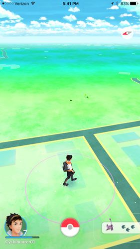
When you load up the game you’re dropped directly into the game (when the servers load, but that’s a whole different issue). The main screen displays your digital avatar and a couple of visual representations on the bottom of the screen.
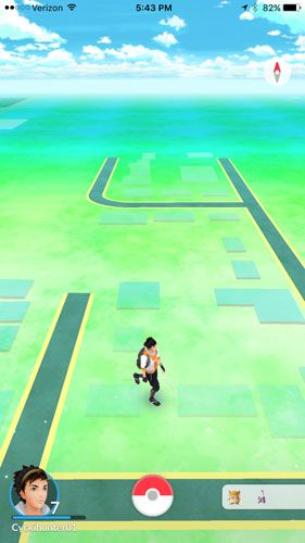
The first issue I take with this is the lack of information that the screen provides you. What does the portrait of my avatar represent? What does the Pokeball do? What is the list of Pokemon on the right?
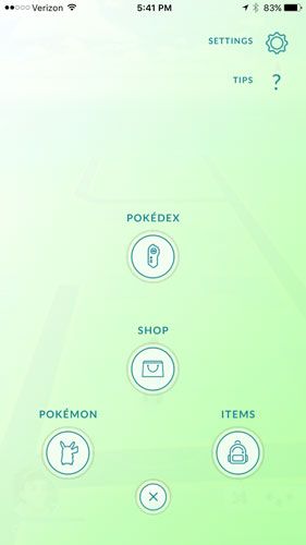
Any “gamer” will almost immediately identify what the portrait represents and how to use it. It’s become pretty standard for a portrait to represent your avatar with additional information, typically a health and some type of energy bar. In this case, the bar is for your trainer level. What may not be immediately identifiable is the fact that you can click this portrait for additional information, such as achievements, a “journal” of recent activity, and [when you hit level 5 and visit a gym] your trainer’s team. The Pokeball is an interesting icon. If you’re familiar with Pokemon you might think you’d use this button to catch a Pokemon you run into in the “wild”, this is not the case. The Pokeball opens up a sub-menu that you can use to view other screens; Pokedex, Shop, Pokemon, and Items.
The last item on the initial screen is the most frustrating one for a lot of players. This bar can display up to 3 silhouettes, or images of Pokemon. It provides no additional information off the bat. When the user does an exploratory tap of the bar they are created with a new pop-up screen. Turns out this bar is displaying “nearby” Pokemon.
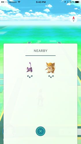
The pop-up menu can display up to 9 total “nearby” Pokemon. If you have seen a Pokemon before it will display their image, otherwise you get a “Who’s that Pokemon!?” style silhouette. There is also a secondary visual on this screen, the footprints. Nowhere in the game does it every explain to you what these footprints are. People have been resorting to googling and trial and error to discover what they mean. Turns out that they represent the distance a “nearby” Pokemon is to your current position. Each footprint represents 100 meters, up to a total of 3 footprints or 300 meters. You can select one of the Pokemon in the “nearby” pop-up menu and it will “track” that Pokemon, displaying only that single Pokemon and a representation of the distance it is away.
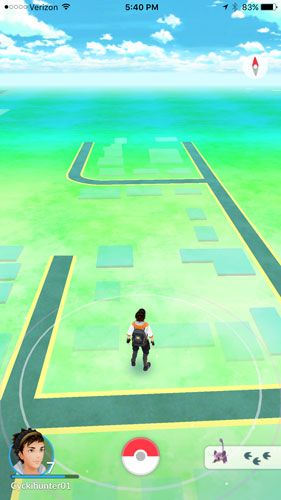
How do I know where the Pokemon are? Is it completely random encounters?
As for finding Pokemon, this is where the game drops the ball again. It doesn’t give you any insight into how to run into Pokemon. If you sit and stare at the screen for long enough you will notice little animations of rustled leaves. Through more googling a player can find out that these animations are showing a location with a higher change of discovering a Pokemon; however if you’re tracking a specific Pokemon there is no guarantee it’ll be that one.
Nice-to-Have Improvements.
After getting the hang of the core gameplay loop and getting to try my hand at a couple of gyms I inevitable came across a situation where I wanted to heal my damaged Pokemon. In this case, I had stationed a Nidorina at a local gym, the gym was challenged and defeated, this resulted in my Nidorina returning to me with 1hp.
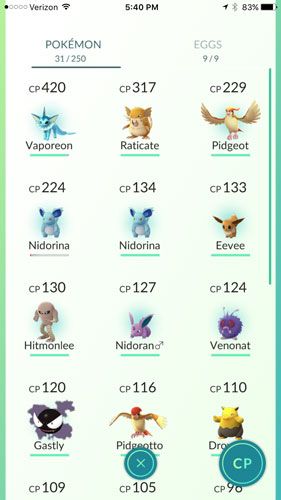
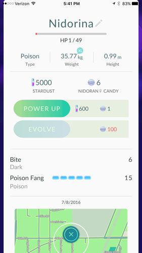
My first thought was to click on the Nidorina in order to heal it. I was taken to the Pokemon’s detail screen where I could see it had 1hp, as well as information about powering it up, evolving it, it’s attacks, where I originally found it, and an option to “transfer” it. None of these options were what I was looking for. How do I heal my poor wounded Pokemon?
I know I have potions in my Items, so why can’t I use one? I decided to go to my items menu and double check that I did in fact have potions.
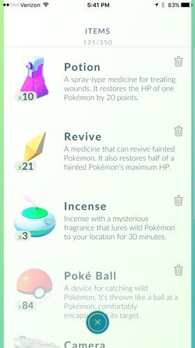
Yup, 10 potions. I decided to click on the potion, and sure enough, you have to navigate to the sub-menu, then to the items menu, then click on the item you want to use. Seems like a lot of steps when I was already looking at my wounded Pokemon.
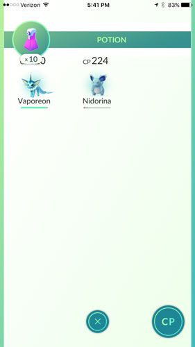
Once you click the Potion (or Revive) the game displays a list of all the Pokemon that would be affected by the item selected. While this is a nice consideration, I still think it would make more sense to allow the player to heal their Pokemon directly from the Pokemon’s detail view. There is no way of knowing that a Pokemon is injured without going into the Pokemon menu, so it seems like a lot of extra steps to force the user out of their current menu, and through 3 additional layers of menus just to complete the desired action.
So, do I like the game?
Don’t get me wrong, I love Pokemon Go. I think Niantic has come up with an incredible game that is amazingly fun when it works properly. I just feel like the product was rushed and more than a few corners were cut when it comes to the UX of the game. I didn’t talk about how the game handles Pokemon battles, but as with everything else in the game, there is little to no explanation about how to participate in them, again the players are left to trial and error or google to figure out how to use the application. I hope the game turns out to be a profitable venture for both Nintendo and Niantic because I see a lot of potential for this type of experience.
Numerous other bloggers and new sites have stories about how they’re seeing other people walking around playing the game. My wife and I have made a sort of meta-game where we try to see who is playing around us; turns out our community is pretty active on the game. We’ve seen at least 5-6 other couples or groups of people walking around playing the game. They’ve got a lot of momentum right now, it’d be a shame to see them lose it; and ultimate lose out on the change to continue growing and exploring this new type of experience, because of a few missteps at the beginning.
As always, keep building better.